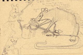
First we have a doodle I did of Banjo Rat receiving the banjo from Papa Banjo rat. I love the sketch, I love how scruffy Papa Banjo rat is.
When I scanned this image in to color it, I just had no idea what to do for a background. Backgrounds are always the hardest part for me to finish, but very rewarding when they turn out nicely. Still doesn't make me want to do them.
I just don't know of the background is overpowering the characters. I wanted to show where they live, in a neat little hollowed out log, but I thought if I cropped it then it wouldn't make sense. But I don't like how small the characters are and I don't like the composition. I don't know how to fix it either. Ugh, I hate backgrounds.
EDIT:
Finished this piece finally. I couldn't make a lot of the elements work, so I just decided to ax them. I wanted to have all these cute homey things, like the rocking chair and a porch light, but I was so sick of this drawing I just wanted it to be done. I'm still not super happy with how it turned out, but it's done and that's good enough for me at the moment.
I do like how the texture on the log came out though :) And I can't get over how excited Baby Banjo Rat is! Look at his big baby teeth! So cute :)


gosh this is so amazing to me. To see how the process begins and what it becomes. I don't know much about animation but its really impressive to watch others do it. Drawing is such an amazing talent.
ReplyDeleteLooks great. If you're concerned about the background overpowering the characters, I think it has less to do with size and coloring as much as it does with the blurred/air-brush style. It may seem counter-intuitive, but having the blurred chair in the foreground actually calls more attention to it than just having it in focus along with the characters would I think. Anyway, looks wonderful overall, hope you can get it to a point where you're satisfied with it.
ReplyDeleteHello: hoping to use your great pic of the bear and the accordion for our village hall dance this new year. You can see it on Facebook here. https://scontent-b-lhr.xx.fbcdn.net/hphotos-prn2/1480662_684853298212746_79162385_n.jpg Who should I credit?
ReplyDelete